When the Nest brand became part of Google, we were challenged to find balance between the two then unrelated brands. What was the common thread? We explored this relationship starting with the most functional expression of the brand: packaging.
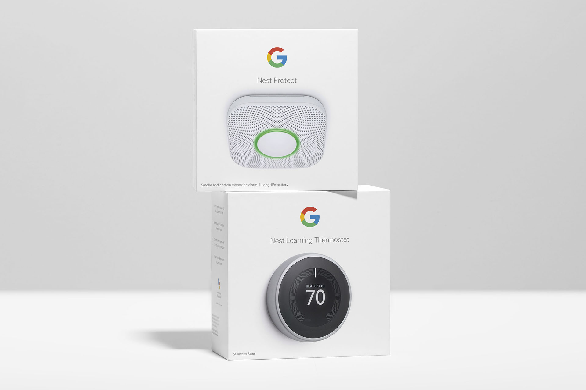
We started with a logo lock-up system and the basic elements that make a brand, demonstrating how these worked across the portfolio.
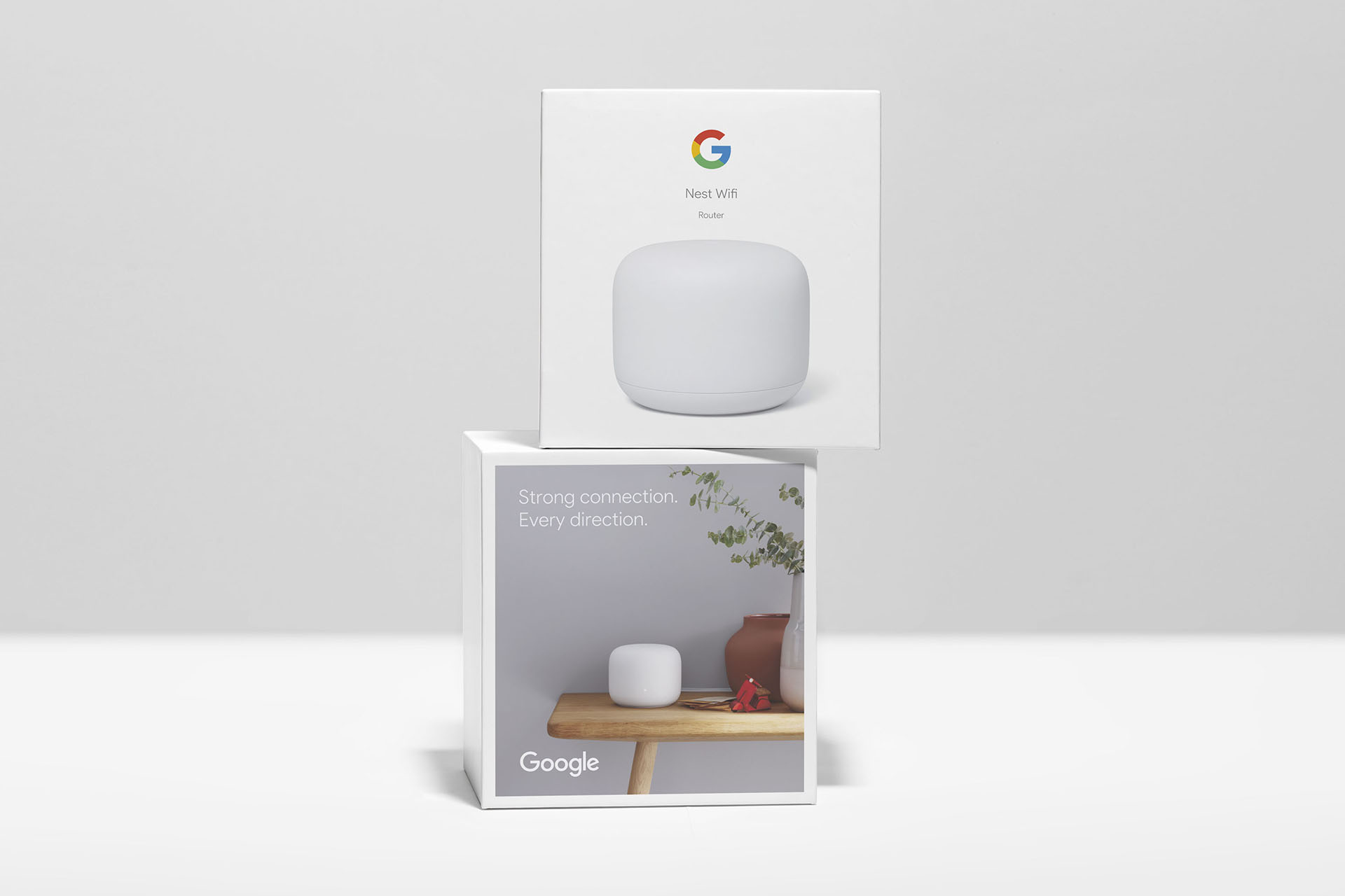
We then started to unravel what the right level of differentiation and personality might be between a brand designed for the home versus a brand geared to gamers or a younger, more expressive audience for Pixel phones.
We found it was in the more subtle details. While Nest’s brand elements were shed: typeface, logo, color palette, we found that the warm, aspirational yet authentic photography was the aspect of the brand that was relatable and connected with the user on an emotional level.
And when framed by Google’s iconic and ubiquitous design language, it highlighted the humanity of the Google brand in the world of tech and devices.
The outcome was a clean, flexible system that connects the wide range of Google products and is flexible for future growth.


Role: Creative Lead, Brand Expression
Packaging and product photography: Robert Schlatter
Packaging CD: Roman Ley + team